MY ROLES
UX Designer
UI Designer
Today, a traveler must go through a long, time consuming, manual process when they notice that their baggage is delayed. The fact that travelers themselves are the ones that have to report the delayed baggage, and not the other way around, is something that suggests that the responsibility lies on the traveler, thus creating a bad user experience. Therefore the purpose of this project was to research how the experience with delayed baggage at airports is today and how it can be improved in the future.
The process used throughout this project was the double diamond approach: Discover, Define, Develop and Deliver and also followed the study done by Fokkinga and how to creat a rich memorable experience.
The Process
Discover
We collected data to understand the current situation and user behaviors through several different methods such as interviews with people that have experienced delayed baggage, experts at SAS and Arlanda airport. We also conducted a survey with over 100 respondents, field research at Arlanda and a heuristic evaluation of the current interface.
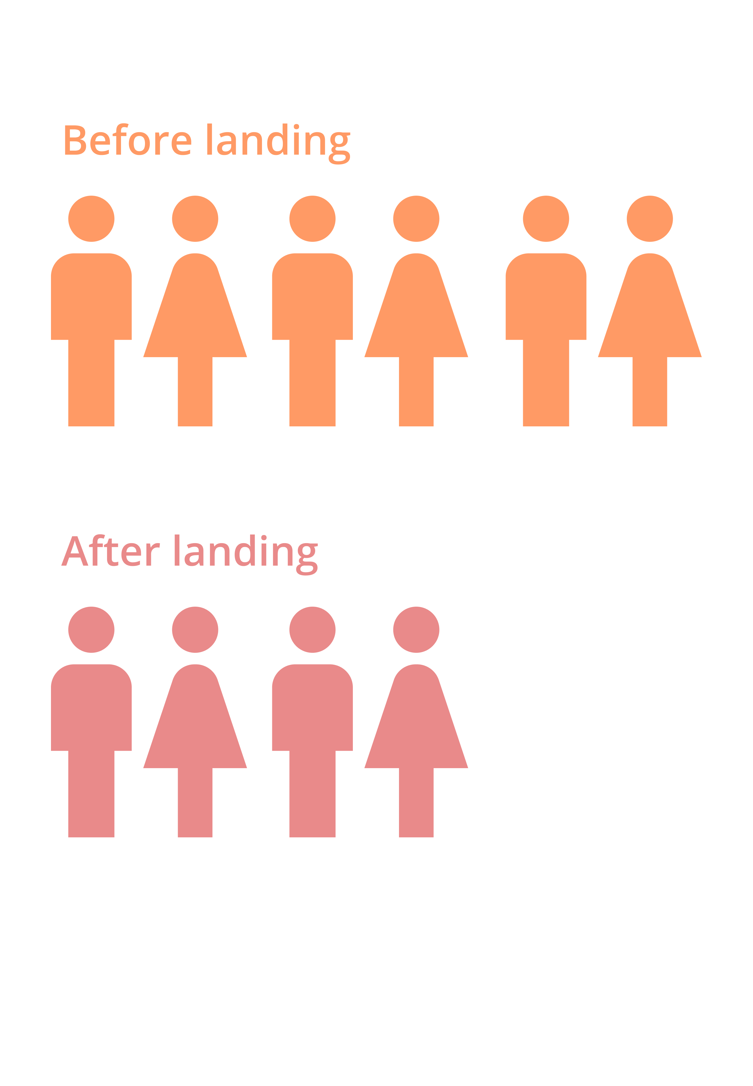
One interesting finding from the discovery phase was that we noticed two different personalities emerge and that there were two sides when it comes to when travelers want to find out about the delay. We saw that one type wanted to know about the delay as soon as possible, and one that liked to stay happily unaware during the flight. What all respondents had in common though, was that no one wanted to find out by the baggage belt.
01
Define
The define phase consisted of mapping of all the data. This was done through Affinity diagram, two workshops at SAS, making a list of requirements and How Might We questions and defining information architecture.
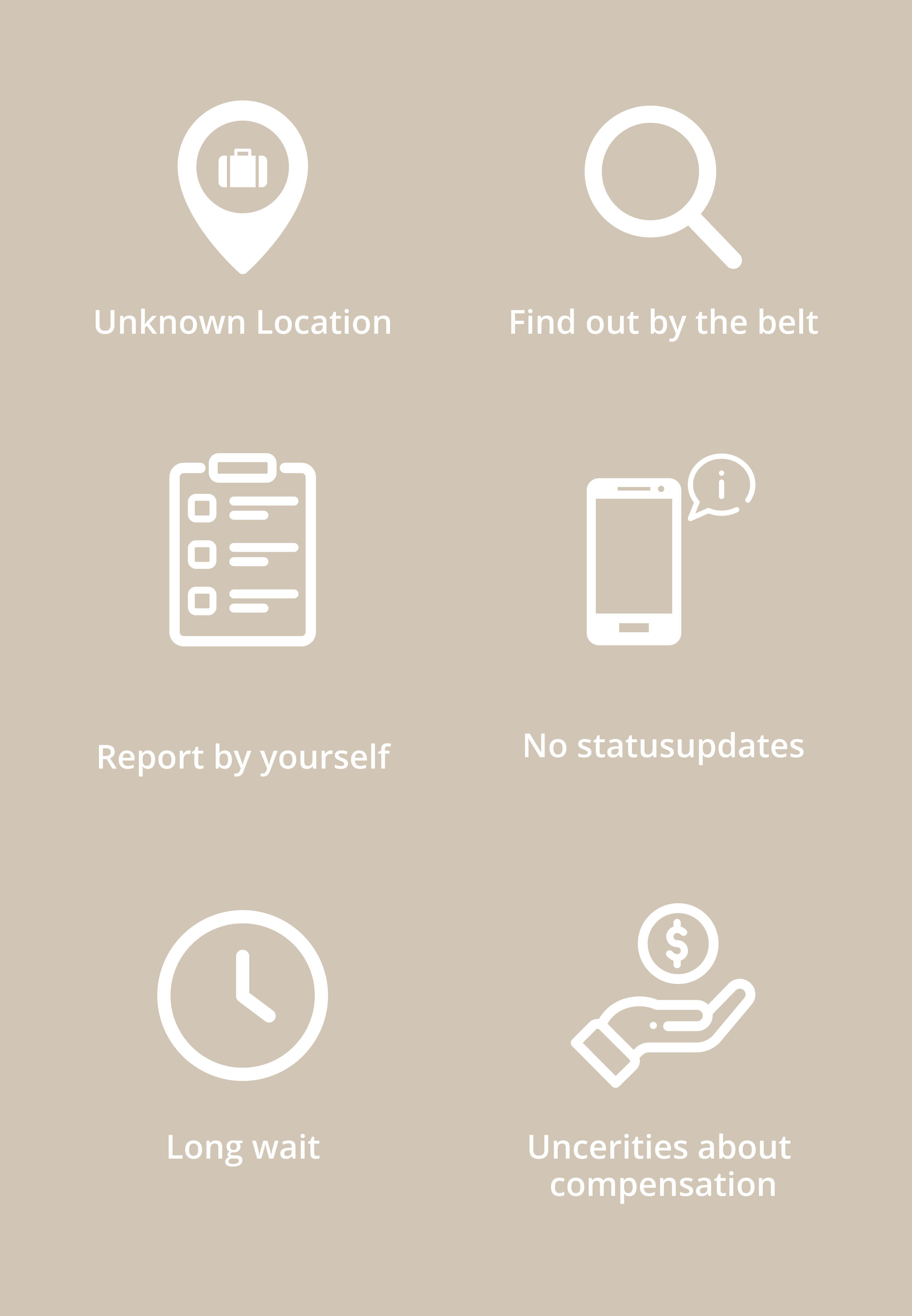
We wanted to see where in the process the travelers had the strongest negative emotions and experienced the most problems. These were the six biggest pain points that we located:
02
Develop
Based on all of the pain points we started to develop a concept, in order to test them and see if they would truly make an impact on the user. We did three sets of usability testing with a redesign after each iteration. All tests followed the same scenario raging from the first one included wireframes and the last one with a fully functioning Figma prototype. The scenario followed the new concept and the journey of the user first assigning bags to their baggage tags at home, to see that their baggage was delayed while on the flight and finally reporting for compensation at the hotel.
03
Final design
Assign bag
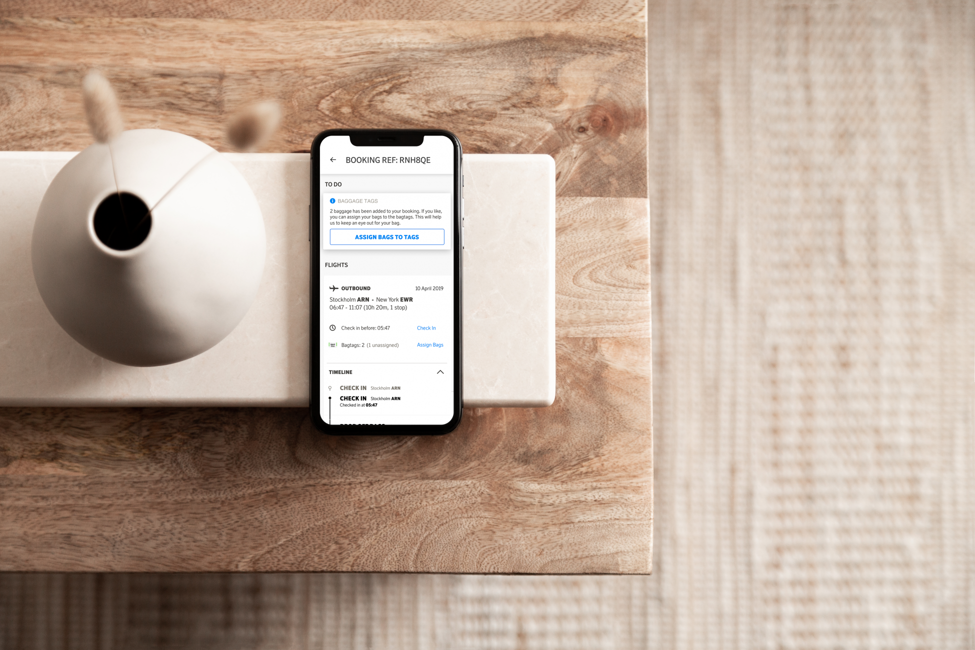
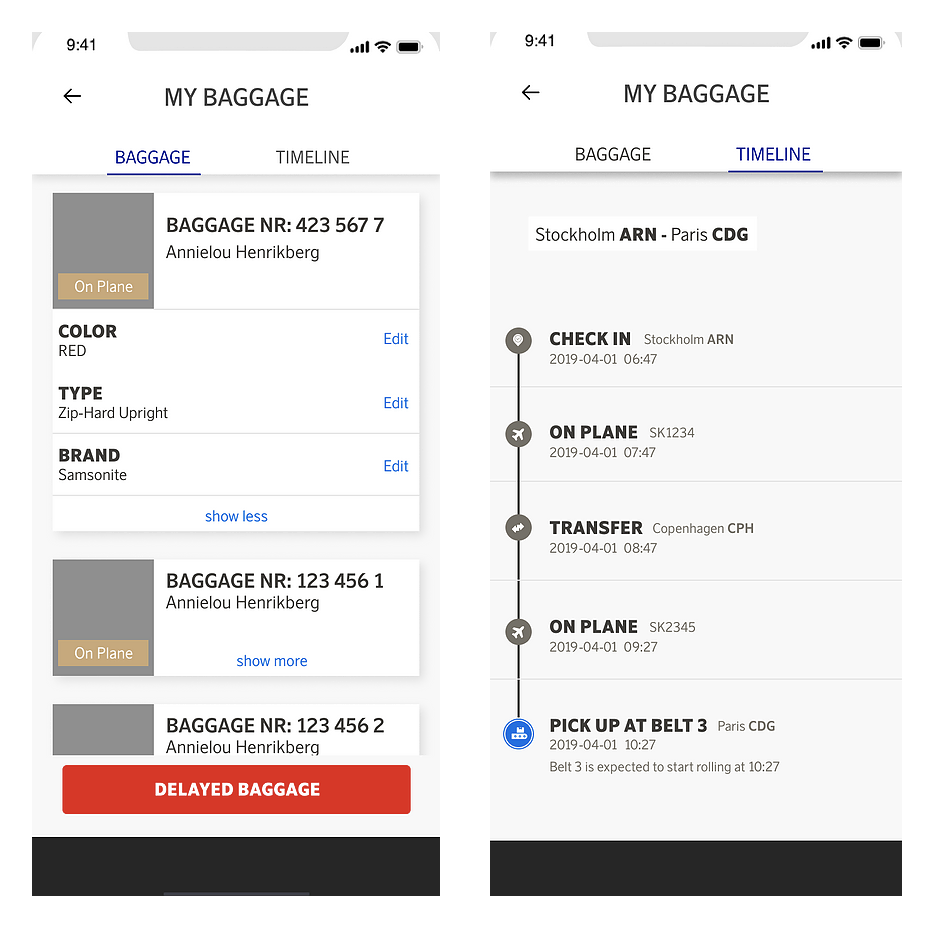
Based on the two major personality types that were identified, there are several different usage flows in which the app can be explored. The first part of using the interface consists of the user entering information about their baggage and connecting it to their bag tag numbers. This can be done prior to the flight, but also later at any stage of their journey. One of the requirements were that the user should not have to manually add the baggage tags to the system, which is why the tag numbers have already been assigned and added in the app as soon as the booking is made. To show visual connectivity with the real tags, these are represented through skeuomorphism in the bag tag view. Another feature, which accommodates both behavioural types, is the timeline view. This view shows detailed information for those who go in and look but does not force any information upon users who are not interested.
Report delayed bag
The biggest focus for the project has been the moment the traveler discovers their baggage has been delayed, and the process that follows. The discovery can happen in several different ways. As soon as the information is available it will appear in the to-do list and in the timeline in the booking reference view. However, a notification has not yet been sent, as there are some travelers that wishes to stay happily unaware until arrival. The delay notification, is sent after landing only if a traveler have not yet checked the app. Either way, no one has to find out about the delay by waiting by the belt anymore. A big annoyance for current travelers were that they needed to report the delay themselves. In the final concept, the delay is already reported when they receive the information. The only thing that is initially asked for is for the traveler to enter their delivery information if they are not going home. The user tests showed that the information view led to the user feeling in control and knowing that the baggage is not lost, just delayed.
Claim compensation
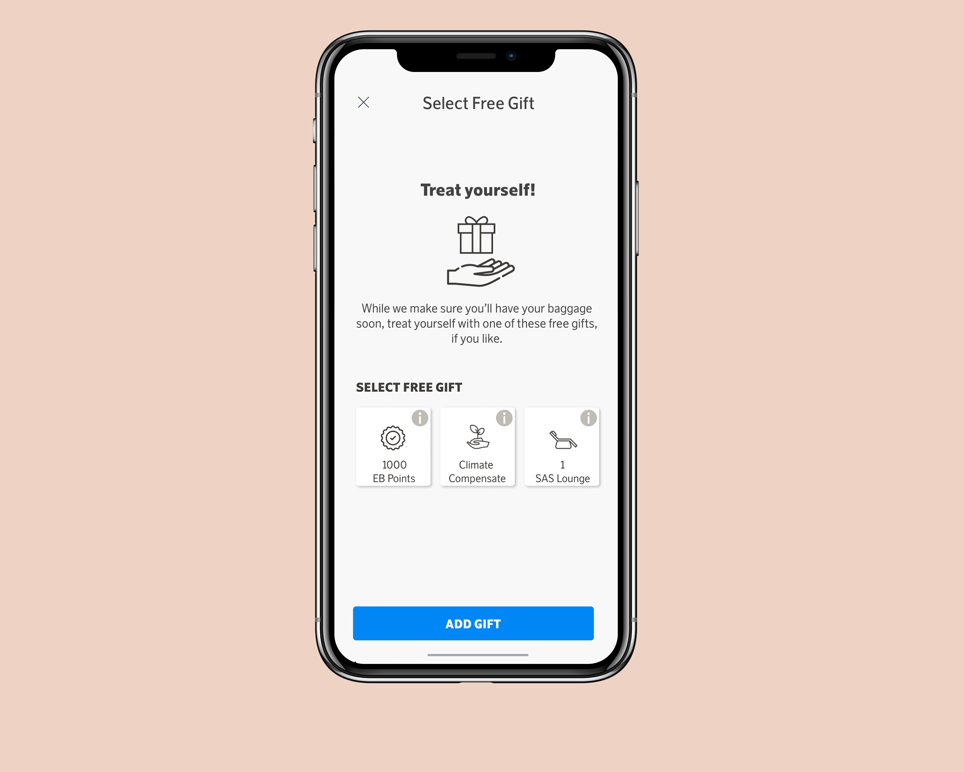
The last step is the compensation view, which gives quick information that the user can later submit their receipts to receive compensation for expenses made due to their delayed baggage. The 3-step process also have a floating button for contact/chat, if needed. Another top ranked requirement is that travelers should receive immediate compensation for the delay. In the current situation this is done by the arrival service handing out a free kit when the traveler have reported their bag missing. Since this is difficult to do in the app, the user receives a small gift instead. As was discovered during the discover phase, travelers do not like to keep track of their receipts and would prefer submitting their receipts continuously. A card for collecting receipts appears in the to-do list, which leads to a view where the user can read more about the terms when it comes to compensation. When all the receipts caused by the delay are added and the bag has been retrieved, the users submits all their receipts together by tapping on the “Submit all receipts” button.


