My role
Svensk Direktreklam is Sweden's largest private direct mail company and employs almost 400 people in 36 franchise companies. They have helped companies deliver targeted advertisements for over 45 years, by using local knowledge of the audience.
Svensk Direktreklam suffered from two outdated systems that lacked performance and needed functionalities while also performing similar tasks. Svensk Direktreklam, therefore, looked over the possibility to merge these two systems. Earlier attempts to do this had been done, but now they needed a concrete plan of how to do this in a user-friendly way.
Senior UX Designer
Prestudy and Process
I joined as a researcher and UX lead to ensure a user-centric merger.
Through qualitative research methods such as observations and interviews, I could identify crucial features as well as user pains and gains when using the two system. I also facilitated user journey workshops with experts of the two systems to understand how the two was used. In continuous dialogue with the tech lead of the development team, I was able to combine them into one user flow and interface. The prestudy concluded the high-level understanding of the user's needs and the technical requirements of the new system. This acted as a foundation for the upcoming development process as well as a time estimation of the design process.

Design process
Since the two systems had long user flows with slight differences made the merging very complex. I therefore divided the systems based on the main functionality and focused on one for a week each. In the beginning of the week we performed user journeys and mapped out all the different steps of the two processes in details to achieve their goals. After that I created a combined user flow and quick lo-fi wireframes that I iterated with the expert users. At the end of the week I had listed all the requirements for the new feature and communicated it using lo-fi wireframes that I haded over to a UI designer. We presented the design early the week after with a combination of mapping out an other feature.
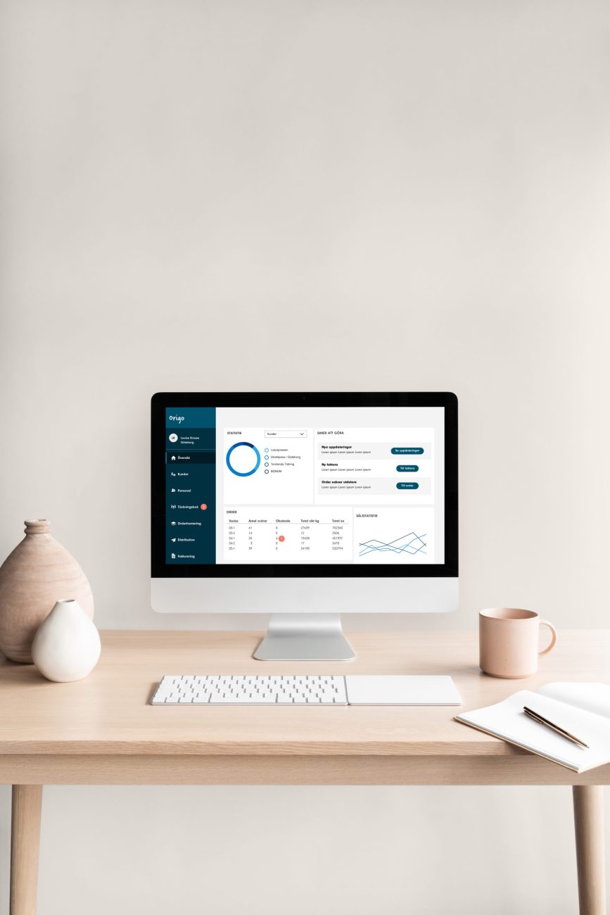
This resulted in a modern user-friendly web-based dashboard design concept that allowed the users to perform tasks efficiently without risking major error. It acted as a vision and foundation for upcoming user testing and implementation.
The prestudy concluded that the two systems performed similar tasks such as manage addresses, creating orders, booking of distribution, and administer salaries just on a regional or local client. It also showed that the two systems were technically neglected, lacking performance and smart functionality that are standard today, leading to long complex user flows and strange interactions. This had made the onboarding for new users a tedious and long process and errors with big consequences were made regularly, such as accidentally removing addresses or residences in the systems.
