MY ROLES
UX Designer
UI Designer
During my time at Icomera, I helped their clients provide a better ride experience for their travelers. Icomera is a company that delivers Wi-Fi to public transports such as trains and busses and their goals are to create a more efficient and more environmentally friendly society. I was responsible for designing the wifi connection portal and in some cases also an entertainment platform hosting everything from videos, music, books, and podcasts. The aim in those cases was to get the users engaged so they would stay in the portal. I worked with international clients such as Metrolinx GO transit in Toronto, Thalys in Brussels and MTR express in Stockholm.
I held start-up workshops with clients and designed everything from user flows and wireframes to hi-fidelity prototypes.
The Process
Startup and ideation

In both Thalys and Metrolinx GO Transit project, I started by redesigning an existing interface made by developers. The general aim were to make it easier to use, mobile-adapted, and fit the customer's requirements as well as their graphic profile
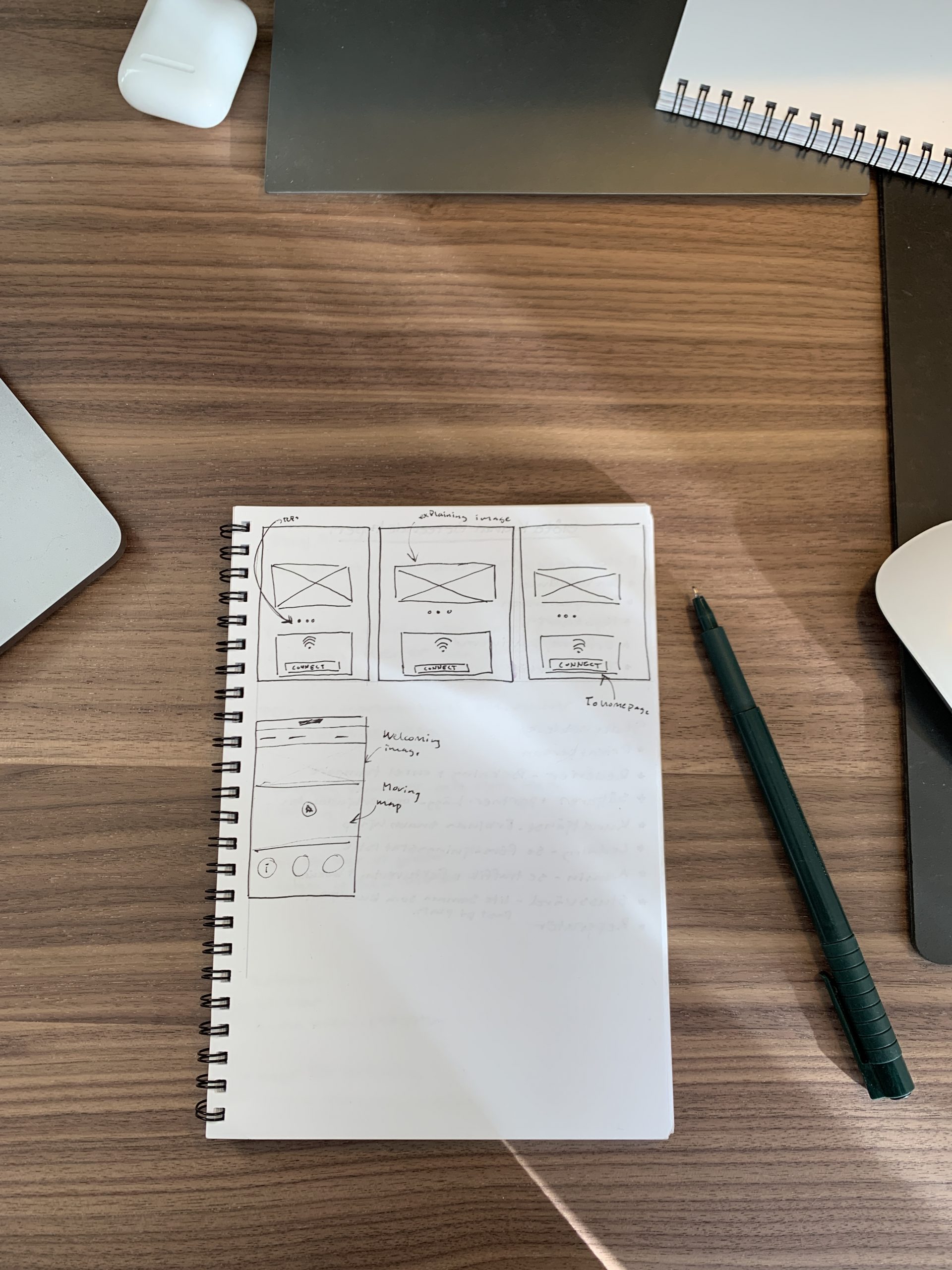
I started each project with a brainstorming session with quick sketches of possible solutions for everything from simplifying the login flow and getting a coherent design and functionality for both iOS and Android since captive portals work differently on the two devices.
In the Thalys project I also held a startup workshop together with the client, lead developer and account manager to define the scope and set expectations.
01
Designing and iterations
Since my customers wanted to have a variety of media in their entertainment portal, I did a quick market scan to see how competitors solve this today. I did not find one that incorporates as many different types today but took inspiration from Netflix & HBO, Acast, Spotify, Readly, and SVT Play and adjusted the solutions to suit this scenario. I did this because these products are leading in their niche and have a clear proof of concept of what works.
When I had a rough idea of where I was going I started working in Sketch and created wireframes that I later showcased in our weekly meetings with the clients as well as a reference group where I would argue my design proposals and align them with feedback. This later evolved into hi-fidelity mockups where I also considered the clients' graphical profile. I'm always validating my work with the WCAG 2.1 AA requirements to design solutions that will work for as many people as possible. In this stage I also create a Design system to both speed up my work and also to make the handover to developers smoother.
02

Deliverables
I worked closely with developers so that I could check ideas and implementation suggestions right away. We worked in two-week sprints where I was one sprint ahead of the development so that we didn't have a scope creep in the middle of a sprint. At the end of each sprint, we first had a demo of what had been implemented and later showed new features that were designed and which were then scooped down to the next sprint.
In this project, I did not conduct any structured user interviews with users, but I was constantly testing new flows and functionality with colleagues and people around me. It gave a good insight into what worked and what needed tweekas.
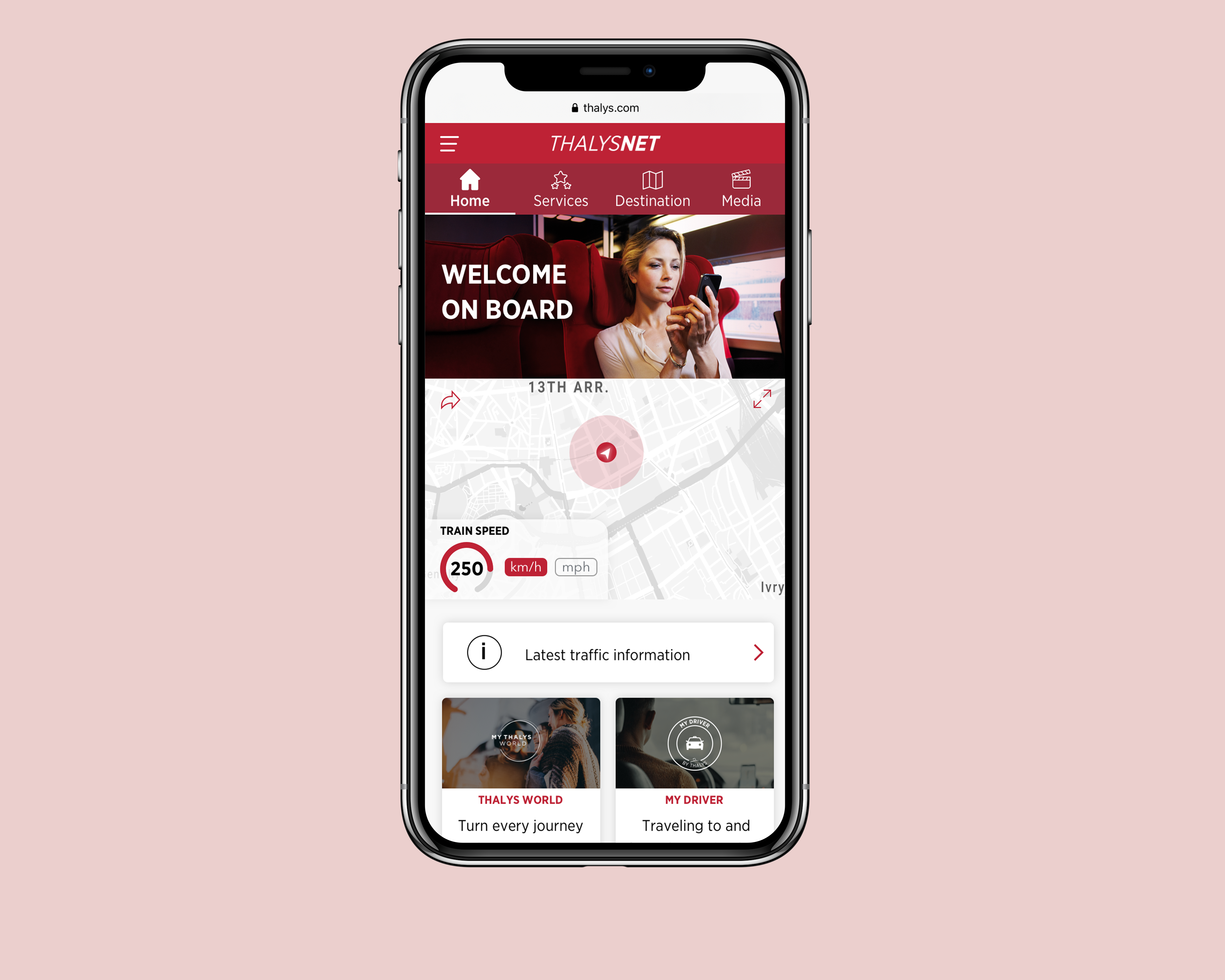
The design below is from the Thalys project. Unfortunately, I don't have any mockups available from the Metrolinx project but you can read more about the project here and watch an introduction video:
Metrolinx Launches First Wi-Fi-Enabled GO Transit Vehicles
And more about the Icomera entertainment portals here:
03


