MY ROLES
Project Manager
UX Designer
UI Designer
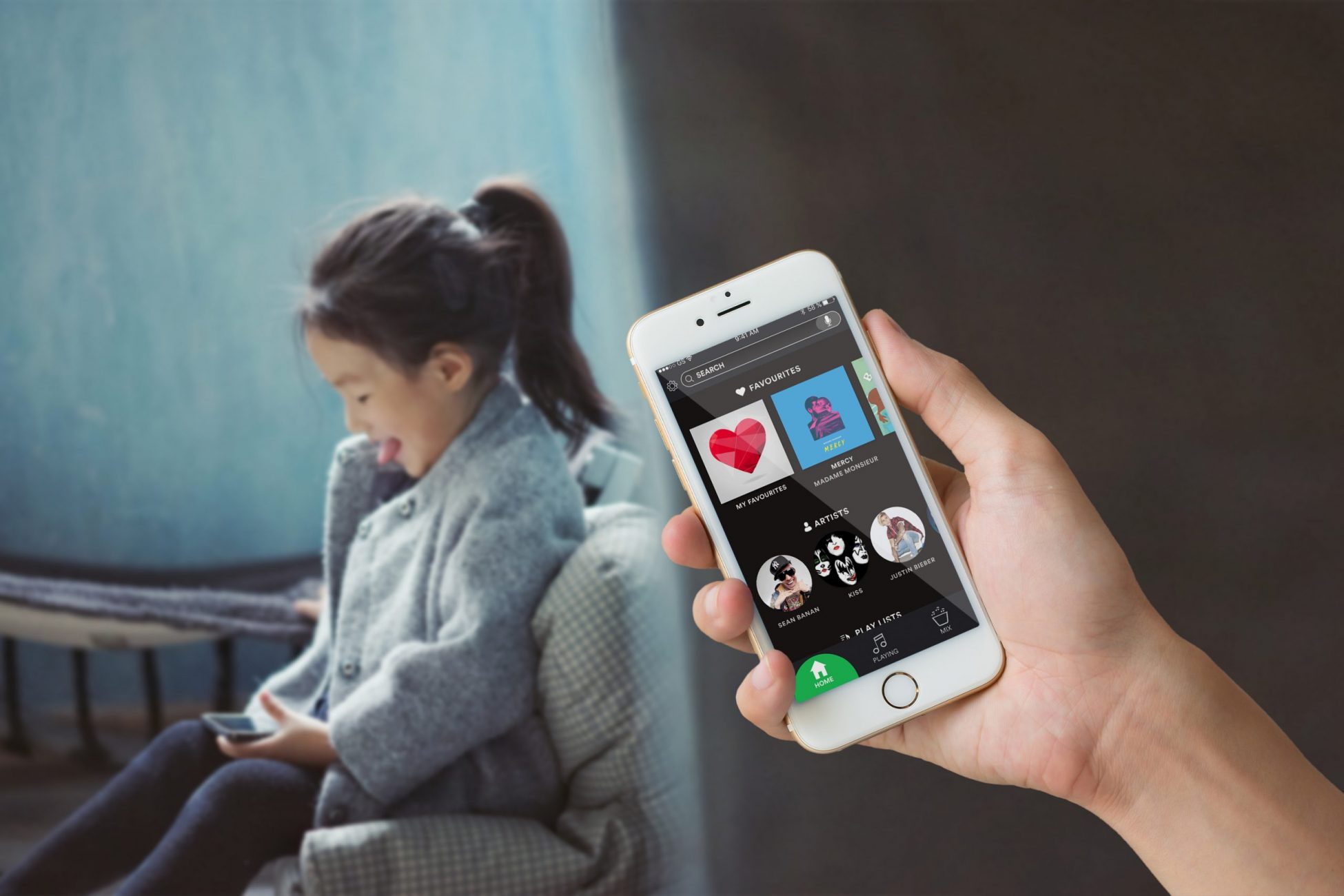
The usage of smartphones has increased for younger children for that last couple of years and 98% of Sweden's six year olds use internet in some form. Many of the interfaces are only adapted to adults even though children are also a big target group. Some streaming companies have adapted their interfaces and content to fit children in a more appropriate way. Spotify however, have not and are therefore excluding this user group.
This was a part of a project course at Chalmers University of Technology and the team consisted of 4 students from the masters program Interaction Design and Technologies: Louise Henriksson, Danny Lam, Annie Rehnberg and Johan Levin. The purpose of the project is to research and understand how children interact with Spotify’s current interface and also see how it could be adapted to fit the target group more appropriately.
The Process
Requirement phase

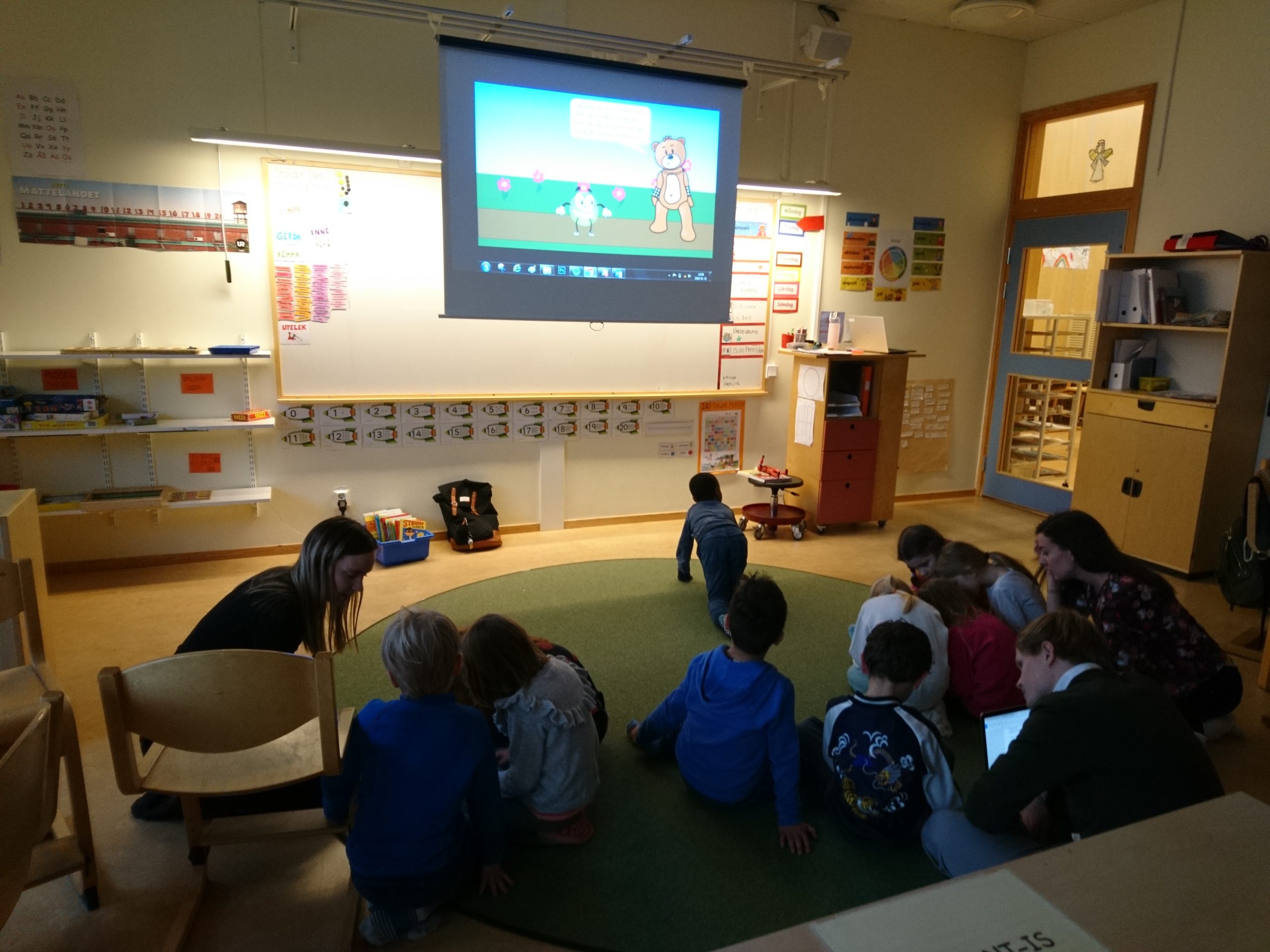
The main purpose of the requirement phase was to gather data which resulted in a list of requirements. The data was collected by using an online survey and five interviews with parents of children in ages five to nine. A workshop was also conducted with ten 6-year-olds, in order to gain real feedback on the Spotify interface.
Some of the key findings were:
01

Ideation phase
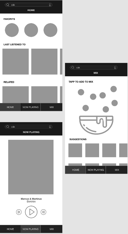
A concept was developed based on the requirements. The design team agreed upon the structure shown in the wireframes to the left. The biggest changes were:
The wireframes were then developed to a interactive prototype in Sketch & Principle.
02
Evaluation phase

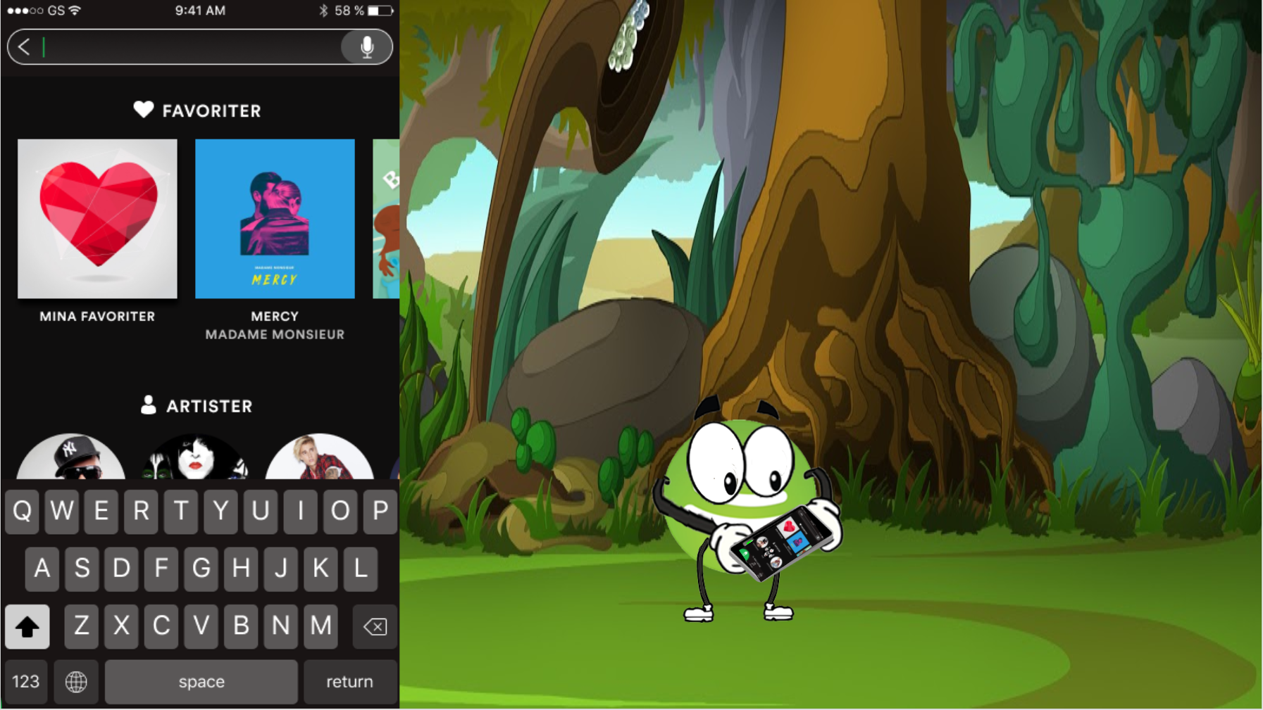
The final design was evaluated through a second workshop with the children. The children were asked to help a character called Spoffe to play a few different songs. One example of tasks could be: “Can you help Spoffe to mix a happy dance playlist?” and let them test the new Mix-function. At the end of the workshop, these were the findings:
With these findings, we created a final concept.
03
The app is divided into three different views: Home, Playing and Mix. The Home screen displays the most listened music, including my favorites, most played artists, most played albums and most played songs. The home view also provides a dynamic view with new top lists that are updated every week. The navigation bar is now color-coded with a unique color for each view.
Final design


